Wake - Versioning
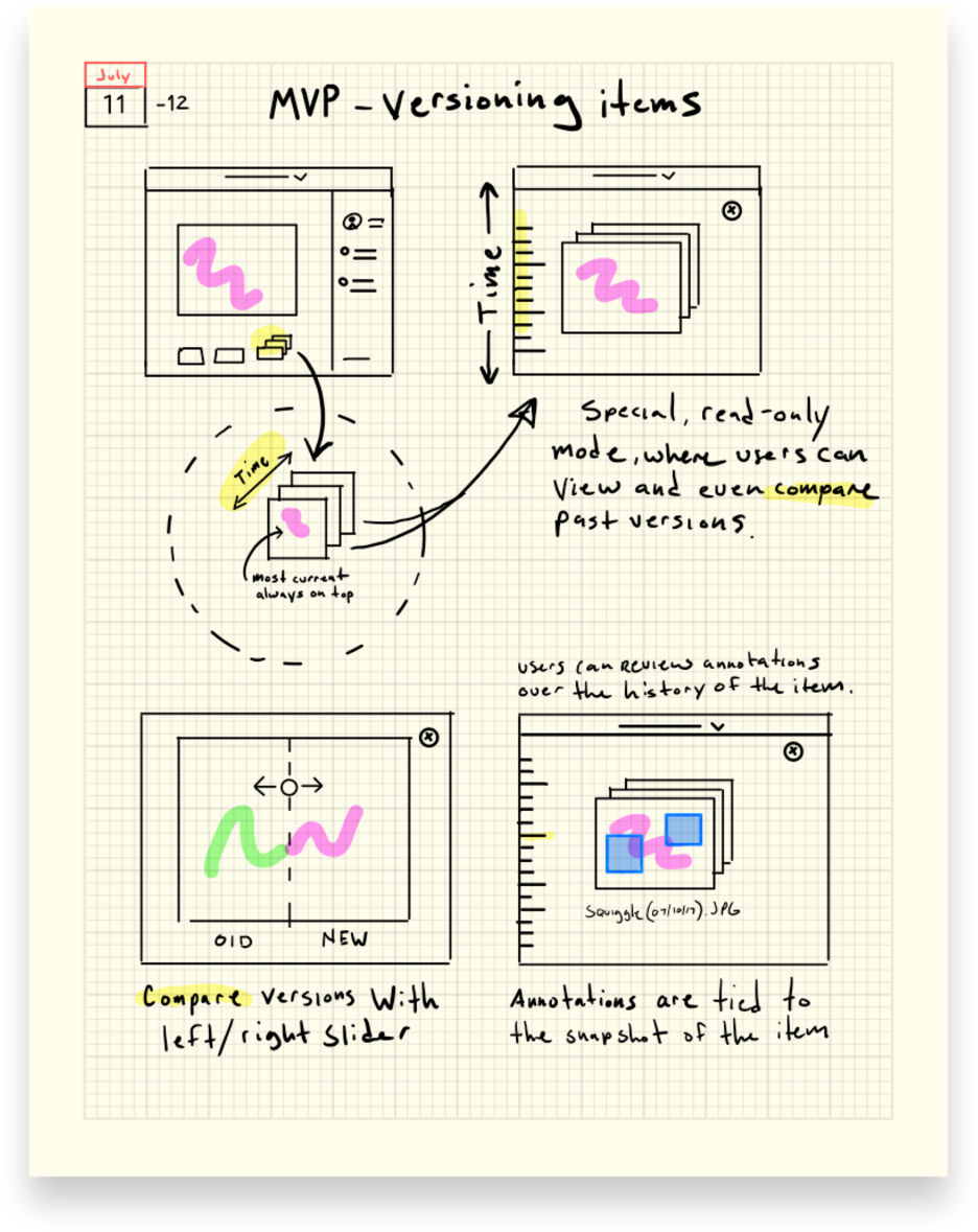
At Wake, I lead the design of our versioning feature. Versioning allows designers to save snapshots of their work over time from wireframe/sketch stage to final pixel-perfect designs.
Our primary goal was to enable designers the ability to keep all of the progress from the lifespan of a project in one place.
This decreased churn, a problem we encountered where multiple versions would be spread out over many posts, making engagement messy and fleeting.
Ideation, Finding the Requirements
Designing a feature that enables users to visually compare past versions of a project against the current version begins with defining the specific user needs and identifying the key elements to be compared. This involves gathering feedback from users to understand what aspects of the project they find most crucial for comparison, such as layout, content changes, or overall design. Wireframes are then created to map out the user interface, focusing on a clean and intuitive layout that clearly presents differences between versions.
Putting it all together
Once the wireframes were validated by gaining feedback from design teams, high-fidelity prototypes were created. These higher fidelity, functioning prototypes enabled designers to effectively simulate the versioning process, showcasing the ability to toggle between previous and current design states seamlessly. Iterative testing with users ensured that the functionality and visual design met user expectations, ultimately enhancing the overall experience of the product.


